The Art “Problem”
So I wanted to make some (more) basic assets under the justification that it would give my game some sort of personality, as well as helping decide on the final aesthetic for the game. Now, the assets I made already looked decent, so there was no real incentive in investing time into this. Even worse, it’s generally recommended to leave art until as late as possible in game development, so what could I possibly have to gain from doing something like this?
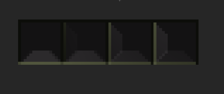
The reality is that there is nothing to gain, and I did this because it’s something I wanted to do. To begin, I played around with trying to make a tile, under the somewhat misguided thinking that this was necessary to start designing levels. Of course, that makes no sense as I could’ve just used a solid color tile and be done with, but that was my headcanon. So I made a basic tile, manually drew the normal map, and imported it. I then came to the realization that it didn’t really fit.


It looked busy, and it was impossible to see the detail when I added an occluder. I’m fairly certain a better use for normal maps would be for decoration objects and to more sparingly use light2D. It could even work well in a 2D pixel game, but I just didn’t feel like it fit very well with what I had in mind. Plus, this would mean I would have to start making lots of normal maps manually, a lot of work for potentially little gain. As soon as I was satisfied with seeing how this all worked, I moved on to something more likely to be actually used in this game.
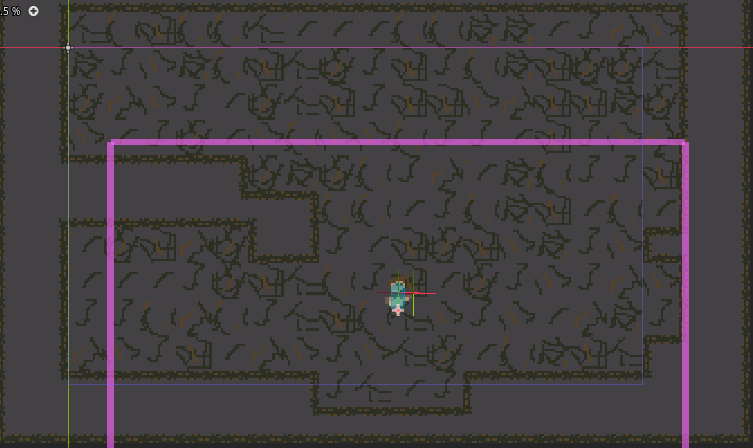
Now, I know I said in my last post that I would try to use as few colors as possible, but unfortunately in the interest of trying to preserve some of the detail I already drew, I opted for larger palettes. I worked on making a tilemap, the idea being that it could be a rusty overgrown lab and you’re an abandoned subject for some sort of super-scout. And so I made an autotiling tilemap, and it looked… messy.
However, now it was time to make the background atlas, such that I would just paint the background. I draw something relatively similar to the tiles, hoping to continue with the abandoned lab vibe, and I painted the background.
The result showed why exactly it was recommended so frequently to keep it simple, especially if you don’t know what you are doing.

The Cleansing
Feeling shame, I typed git reset --hard and decided to do this right this time.
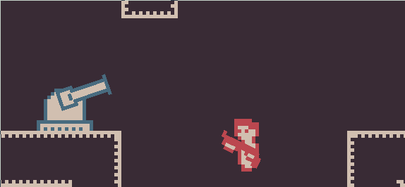
I cleansed myself of those pesky 10-color palettes and went with the retrotronic 5-color palette.

I was entranced by the cool colors contrasted by the red highlight, I decided it would allow for a striking appearance while remaining simple enough such that even I wouldn’t be able to screw it up. I decided that our main protagonist would be the one enshrined with the red highlight. Taking advantage of the fact that I already had a general model (I liked the shape), I opted to use a light fill and red outline. The background and tiles are dark with light outlines. All very simple stuff really, took less time than the other endeavours.
And you know what?
Once I saw the end result, it looked much better!
